January 13th, 2021
User Interface Design Fundamentals – Part 1
Table of contents
UX/UI designers are responsible for transforming system and business requirements into a given design. Designing is not an easy task, as these requirements must be translated in a way that maximizes the usability of the interface and meets the needs of end-users. An interface is a place where people and new technology meet, so it has to facilitate communication in the best way possible and be aesthetically pleasing. In this article, we discuss how to correctly use interface elements to create a design that is both useful and visually attractive.
Color in User Interface design
In general, colors are crucial when it comes to interface elements and brand building – note that brands usually have specific colors that are characteristic for them and that they use consistently in all branding materials. On the macro level, the color attracts users’ attention and helps generate meaning. On the micro-level, it’s important to remember that the color should be used to emphasize meaning. Here’s what color can do when it comes to reinforcing any kind of user interfaces:
Color in UI design supports interactions
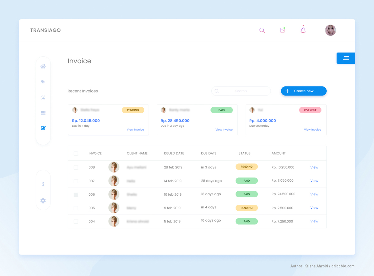
The classic example is known to all online users: a text highlighted in blue means it’s a clickable link. This is just one of the many ways in which color supports interactions. Take this invoicing interface design as an example: the user can immediately see which invoices have been paid, which are awaiting payment, and which should be investigated for issues – all that through the appropriate use of green, yellow and red colors. When using colors in UI design this way, always remember that they must work with the semantic meaning.
Color in UI design improves readability
The choice of colors for your UI design will help you with building a visual hierarchy and navigate the user through information architecture. Vivid colors or high contrasts will draw users’ attention, so they should be used to accentuate the elements we want the user to see or read at first, improving readability and logic.
Color in UI design navigates users
Using selected colors in a consistent manner is at the core of any design system – it teaches users specific habits. Colors help navigate the user through elements of the interface or a group of interfaces, as long as they are used systematically. For example, marking interactive elements within an application with the same color will emphasize interactivity. Thanks to the consistent use of colors, we can create our own design system and the hierarchy of new elements for our system.
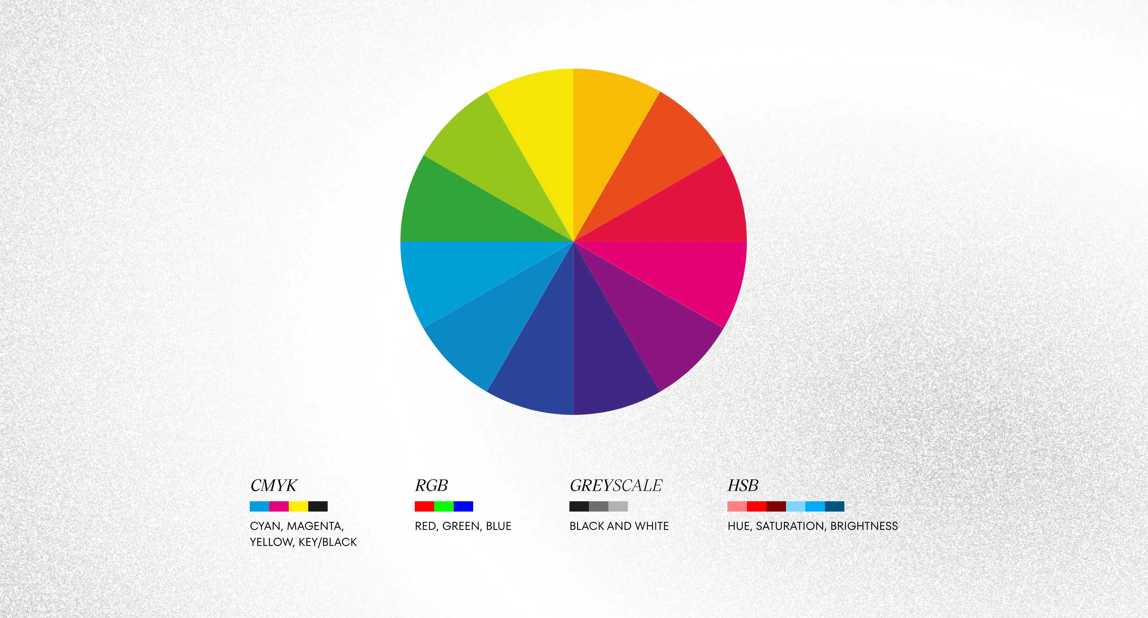
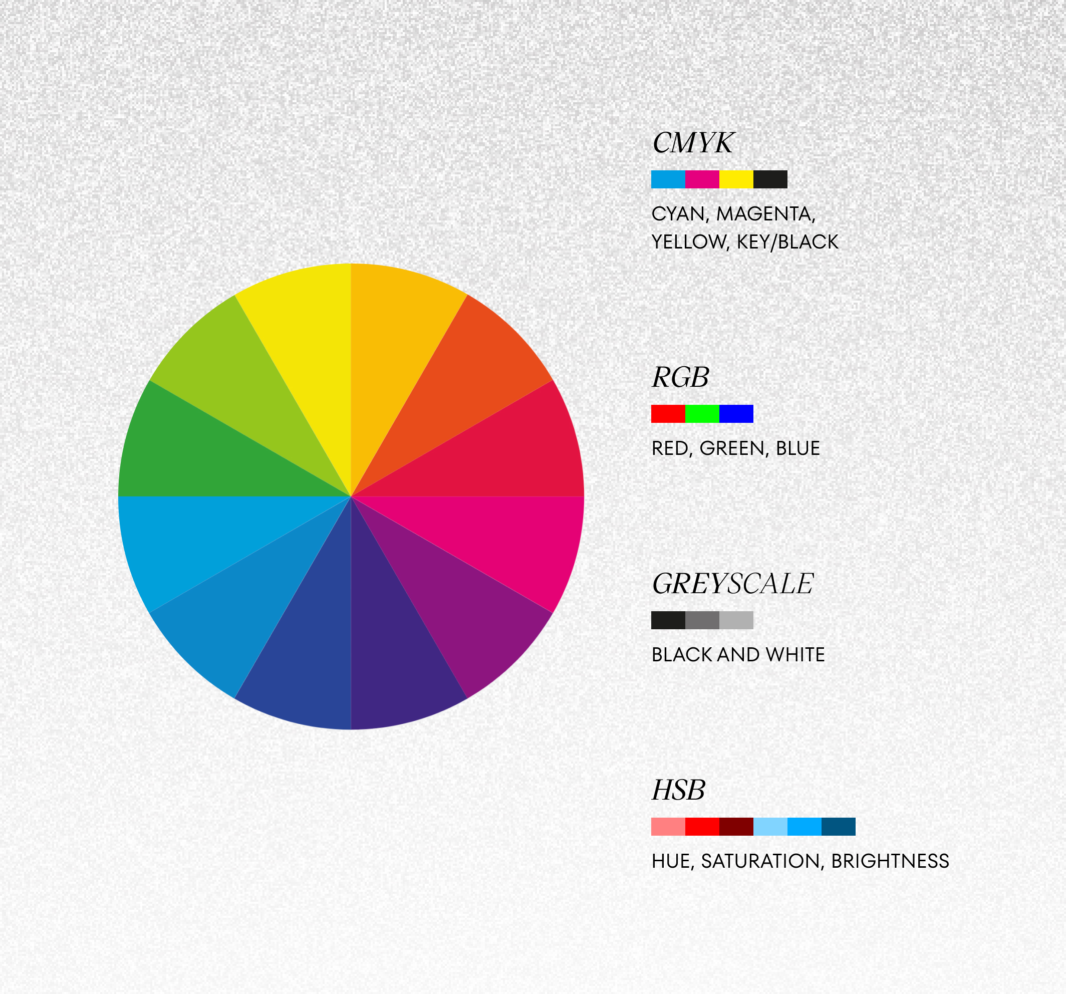
How to choose colors for UI design appropriately? Selecting colors for any user interface project should take into account the Color Theory, which determines which colors go well with each other and what they mean.
Today, we have excellent applications that help us analyze our choice of colors. Adobe Color is one such app; it allows designers to generate an aesthetic color palette, based on the principle of color harmony. Using such applications will allow you to choose a well-harmonized color palette.
Another tool that may be helpful in designing the user interface is Material Color Palette. It helps select matching color combinations with mathematical precision! Material Color Palette applies mathematical principles worked out for Material Design, the design language patented by Google, to suggest colors and shades that work with each other best.
Great UI designers keep it in mind!
Remember that colors in UI design are subjective. They have different emotional and semantic values across the world. When you’re creating an application for multiple markets and intend to communicate something with color, make sure that color doesn’t mean something else in a given culture.
MAKE UNFORGETTABLE USER INTERFACE DESIGN WITH US
FILL IN THE FORMTypefaces in User Interface design
Each of them has its own “character” and unique elements which can help create the right feel of any interface. There are five basic types of typefaces you should know as they are UI design fundamentals:
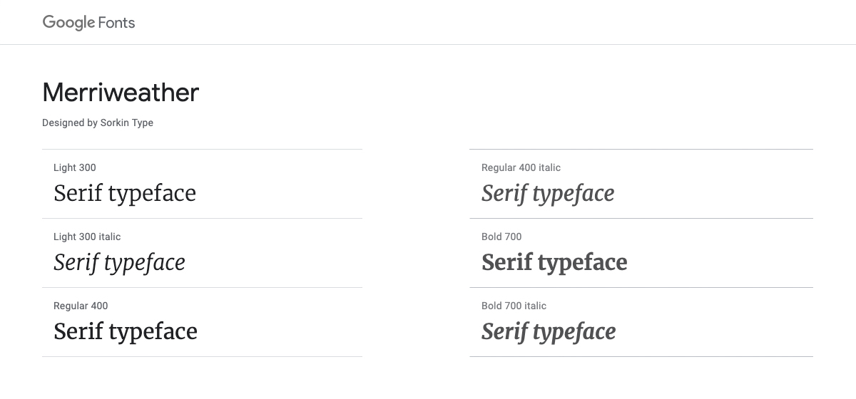
Serif typeface
It’s the one with wedge-shaped endings at the end of the letters. It’s considered the traditional typeface because it comes from ancient Rome and it’s actually the oldest of all font types. If you want to use a typeface that is neutral or isn’t too attention-grabbing, use a serif type with equal width along each part of a letter.
A serif typeface with letter parts of different width/thicknesses, like in e.g. the well-known Vogue logo, is perceived as a more elegant font and usually associated with beauty and fashion industries.
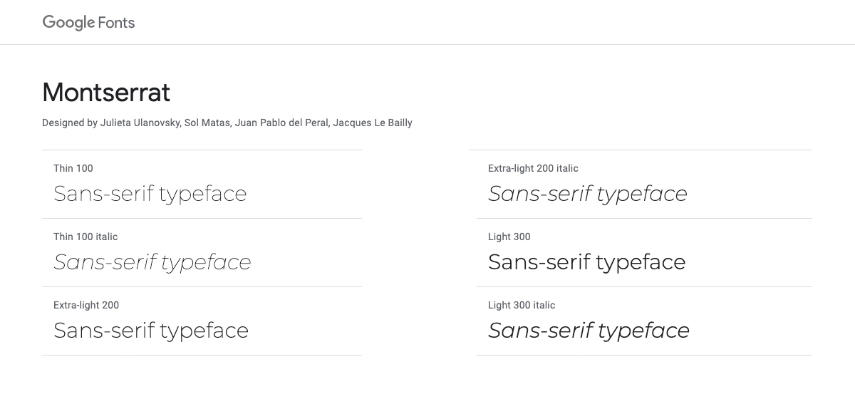
Sans-serif typeface
This typeface is without wedge-shaped endings. They were created, or rather popularized, in the twentieth century and at that time seemed simply grotesque. These typefaces are perceived as modern and mechanical – the more so the more geometric they are in shape.
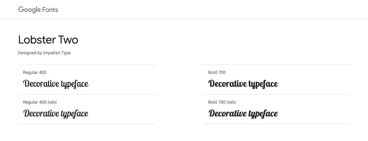
Decorative typeface
They’re also called display typefaces and are very individual in character – every typeface of this kind is very unique. We use them for artistic means of expression. If you’re a beginner User Experience and/or User Interface Designer, use them with caution (remember the principles of UX design!).
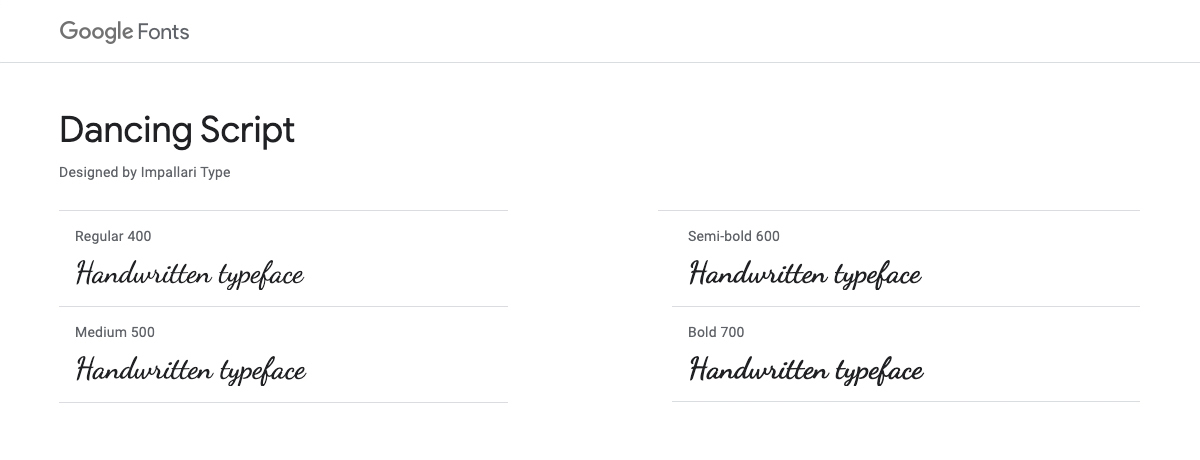
Handwritten typeface
These typefaces, as the name suggests, reflect the handwritten text. They give an organic feel to your UI design, but unfortunately, they have a visual defect: they are not easy to read (think about it in terms of user experience; of course not for every user will have this problem, but be careful with this font) and therefore are unsuitable for blocks of texts. Luckily, they work very well with such visual elements as headings.
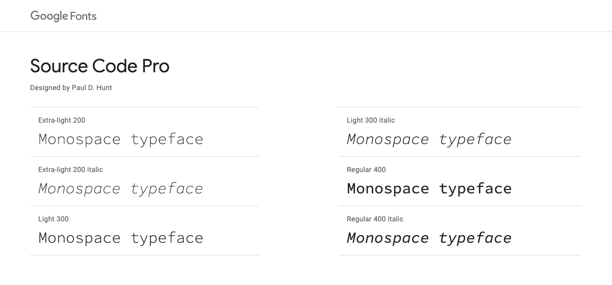
Monospace typeface
Monospace fonts were inspired by how we used to write on a typewriter. Each letter has the same width and occupies equal space in a line of text, which is why such typefaces are perceived as mechanical. You would usually see them in code, to distinguish them from regular text. I recommend them for very specific designs and uses only.
You can find the above categories in Google Fonts. I highly recommend this tool because Google buys the right to use great typefaces created by professional typographers, and makes them available for free. You can implement them in your UI design in a very convenient way by adding a link in the CSS file. Google also suggests which typefaces match together which is also great.
User Interface design fundamentals includes also icons
We can distinguish between system and product icons, depending on their purpose. The first one is used for functional purposes, like navigation, marking interactions, or helping to generate meaning in designs of a system or application.
In fact, the division into types is wide and we’re usually talking about families of icons. A good user interface design will make use of a specific family. Within one family, the most important thing is consistency, which should apply to stylistics, weight, elements that are repeated, and the grid, i.e. the square on which it is described or inscribed depending on which families we are talking about.
Based on the appearance, the six types of icons you should know are:
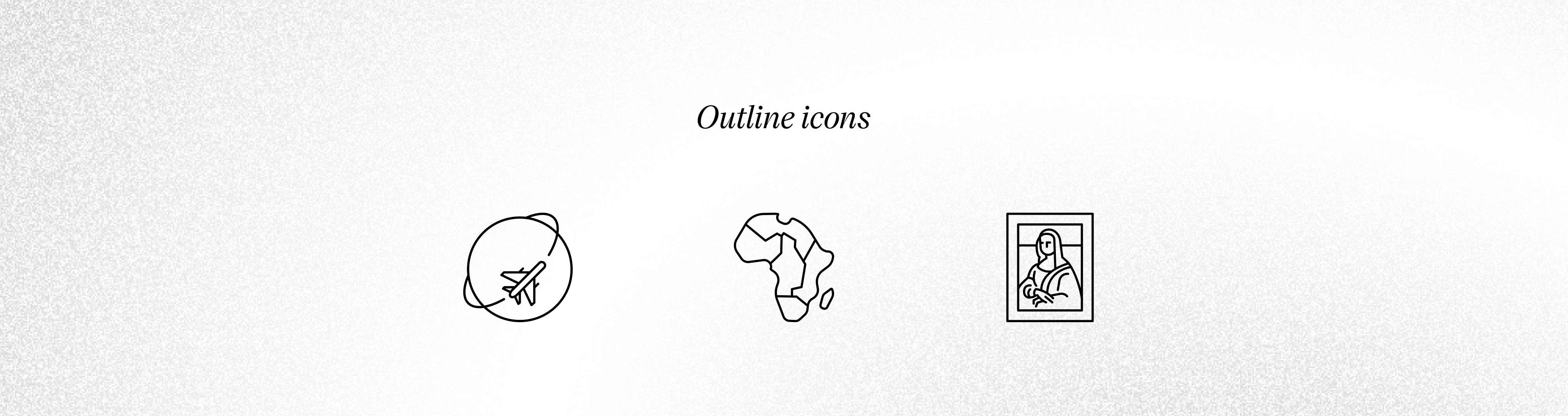
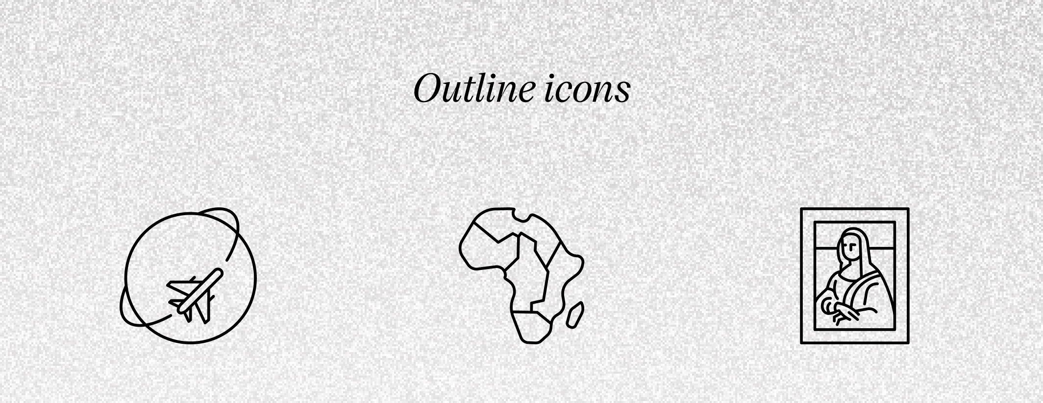
- Outline icons: their essence is in an outline. They are perfect for any mobile app and web applications as information carriers.
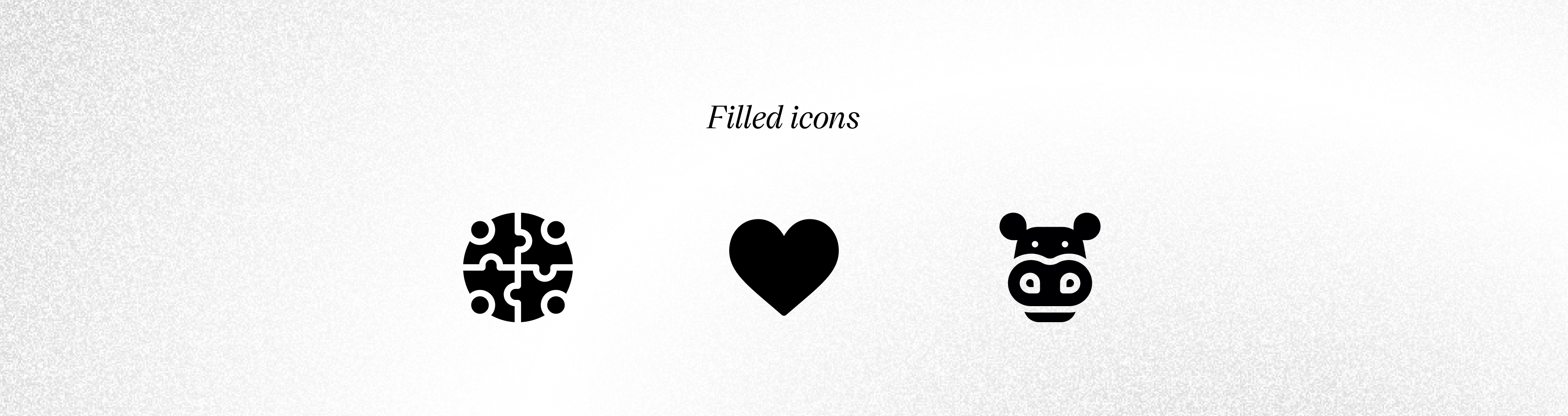
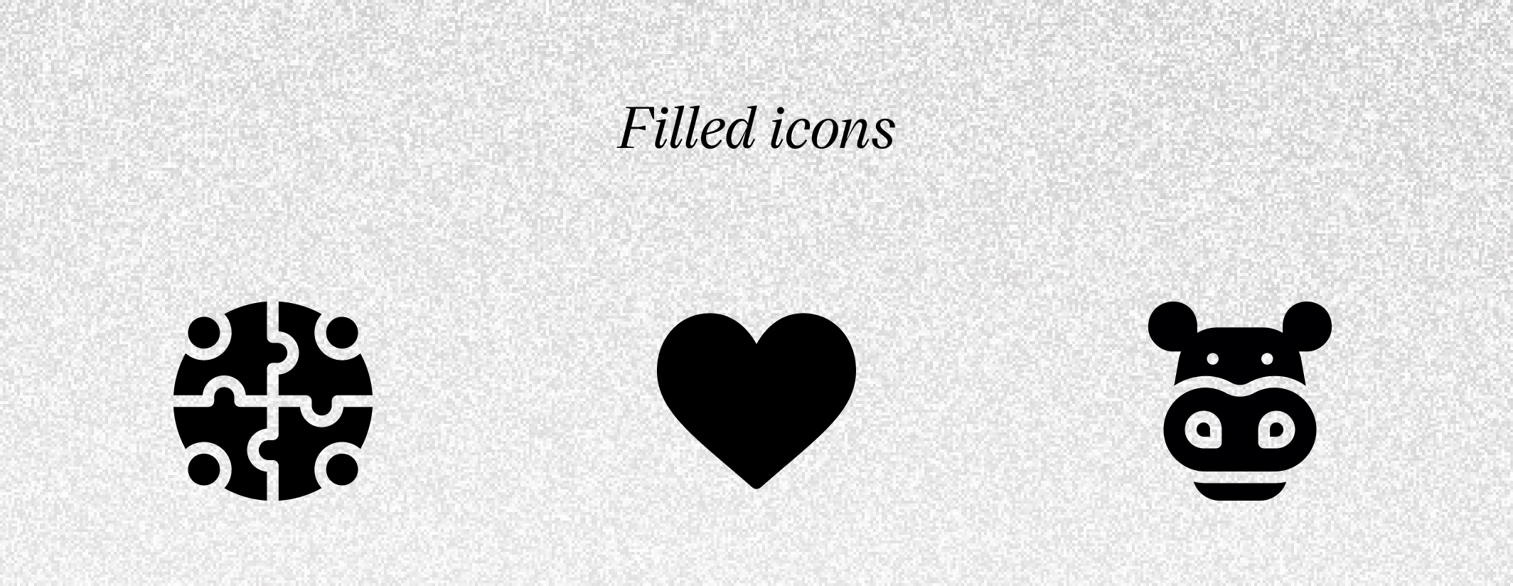
- Filled icons: they can be used as system icons, more visible and visually heavier. You must use them consciously.
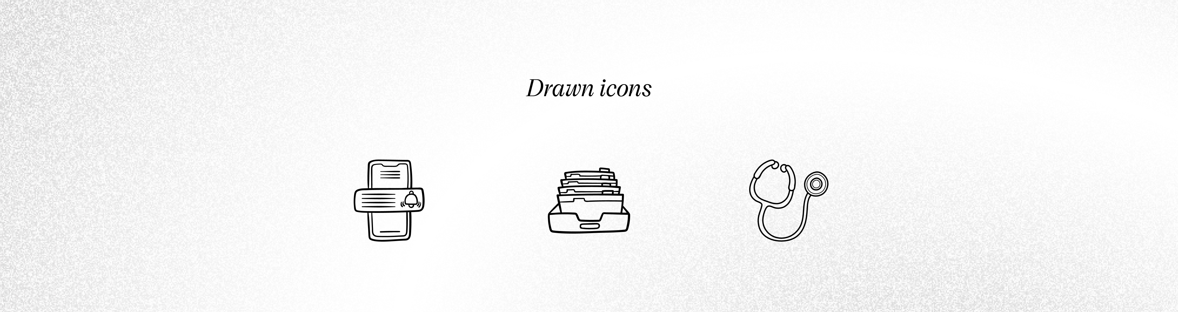
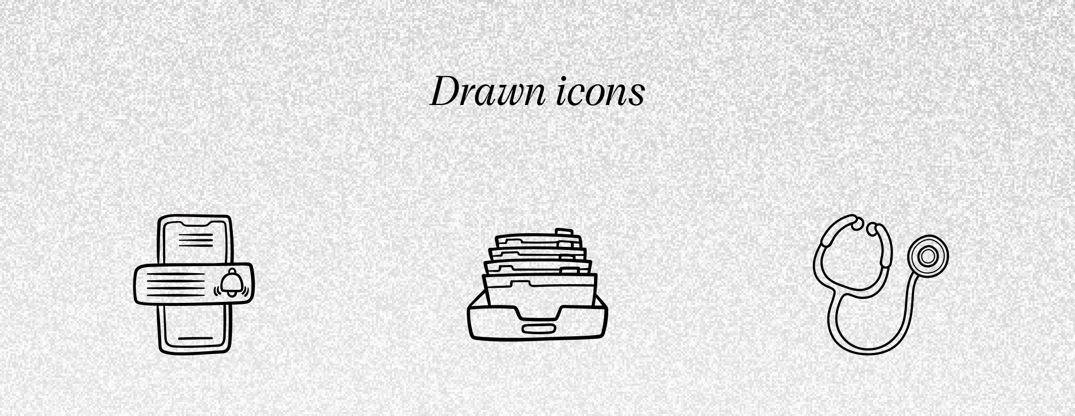
- Drawn icons: currently the trendiest, we like them a lot! They can give any application a customized look.
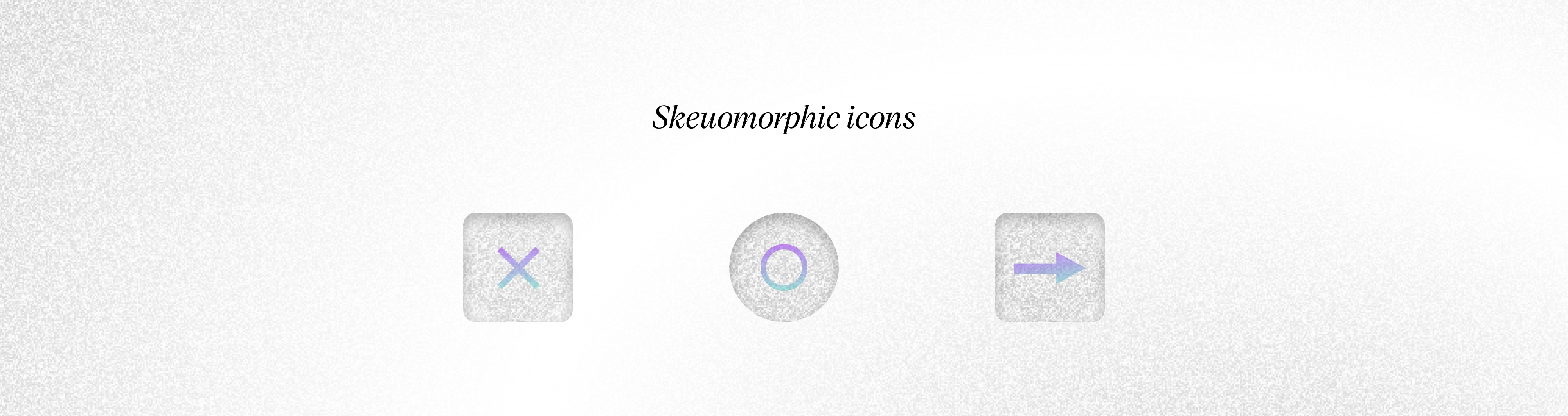
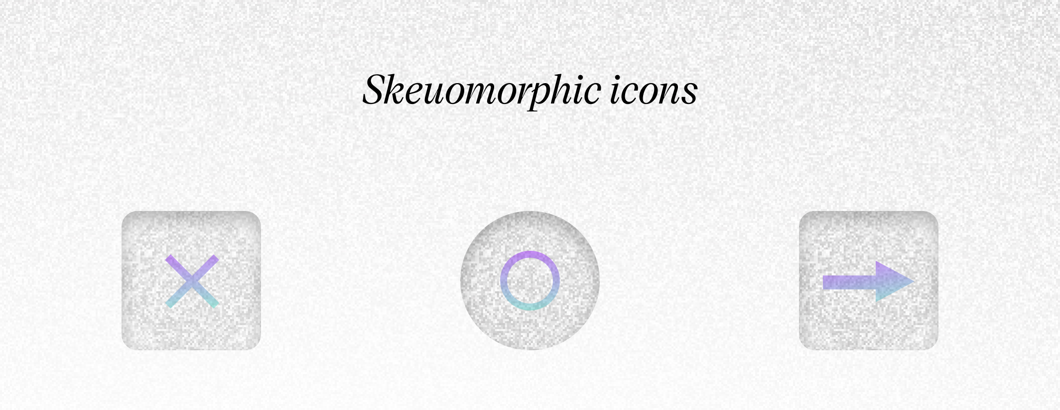
- Skeuomorphic icons: through their shape, they try to recreate the properties, texture, color, or function of the object they describe with their look.
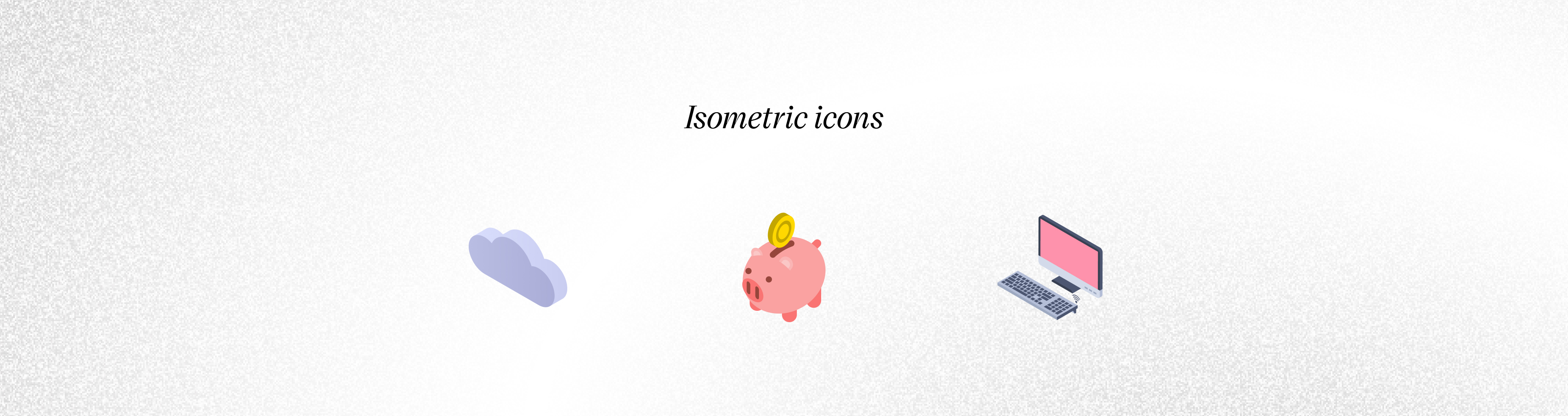
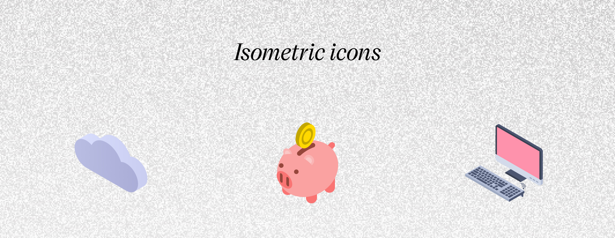
- Isometric icons: they “pretend” to be 3D icons, but they are only their 2D representation. They are more eye-friendly and aesthetic and they are a good choice for product or system icons.
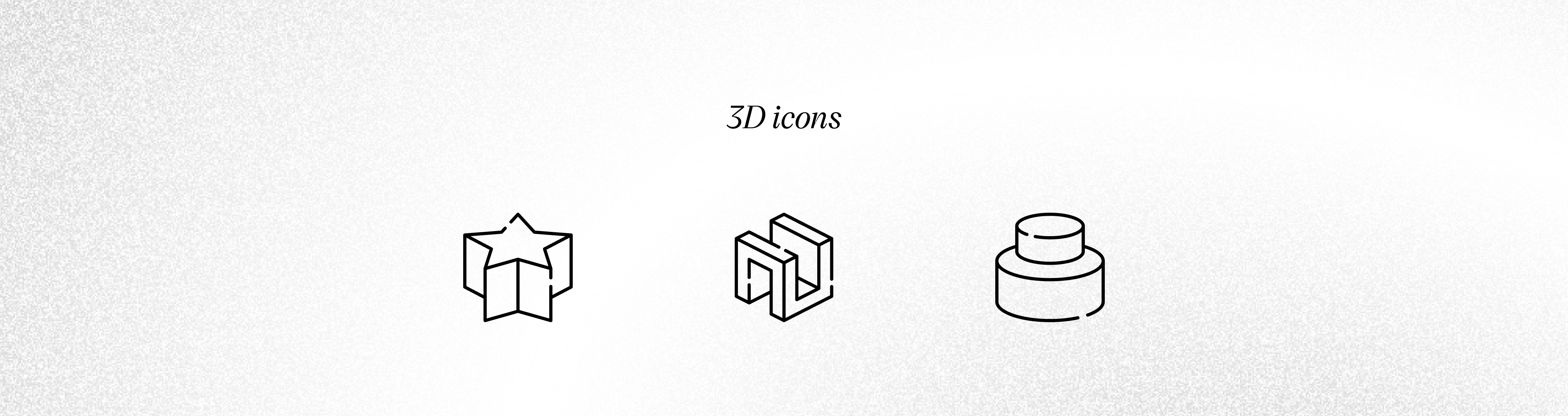
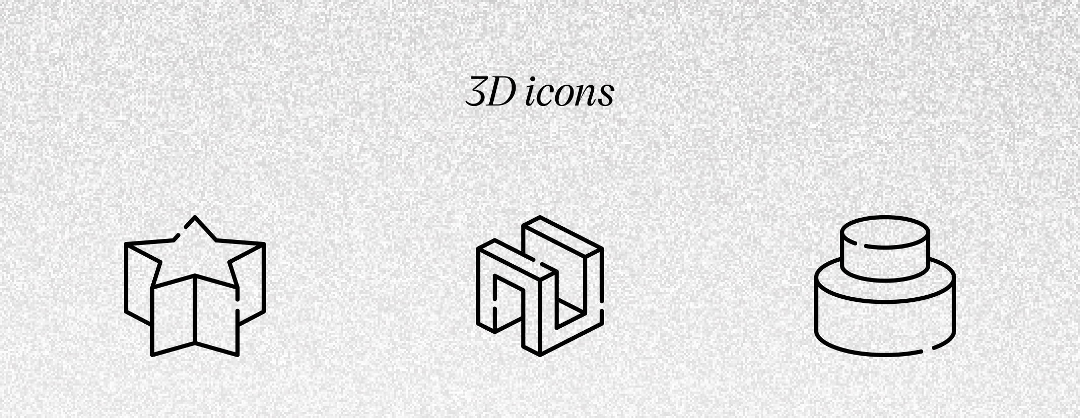
- 3D icons: they are most often used as ornaments in applications. They won’t be a good choice for every system icon unless you want to make a strong visual accent.
Typical sizes of icons always fit into a regular square grid. All of them used within an application should always have the same size, which is very important. Typical sizes that we use in the UI design of applications fit into the dimensions 16×16, 20×20, 24×24, and 48×48. Other sizes are used for product icons.
You now know the UI design fundamentals. If you’d like to know more about visual design principles and best practices of user interface UI design, read our post about “What is a User Interface? – Analysis” or the post about “The UX Design Strategy in the Software Development Process”. Additionally, we are working on a post, which will be a continuation of the topic of UI components.