May 5th, 2020 | by Alicja Krawczyk
Why Low-Fidelity Prototype Matters?

Table of contents
Low-fidelity wireframe: what is it?
In general, the low-fidelity (lo-fi) wireframe is a simple interface visualization for the digital product. It can take the shape of sketches, titles, and short flow descriptions. No colors or typography adjustments (this is left for the high-fi step). If it works in greyscale, it will work with colors. The focusses are only on the essential concept for screen organization and basic functionalities. The role of low-fidelity is to validate functionalities rather than decide on styling aspects.
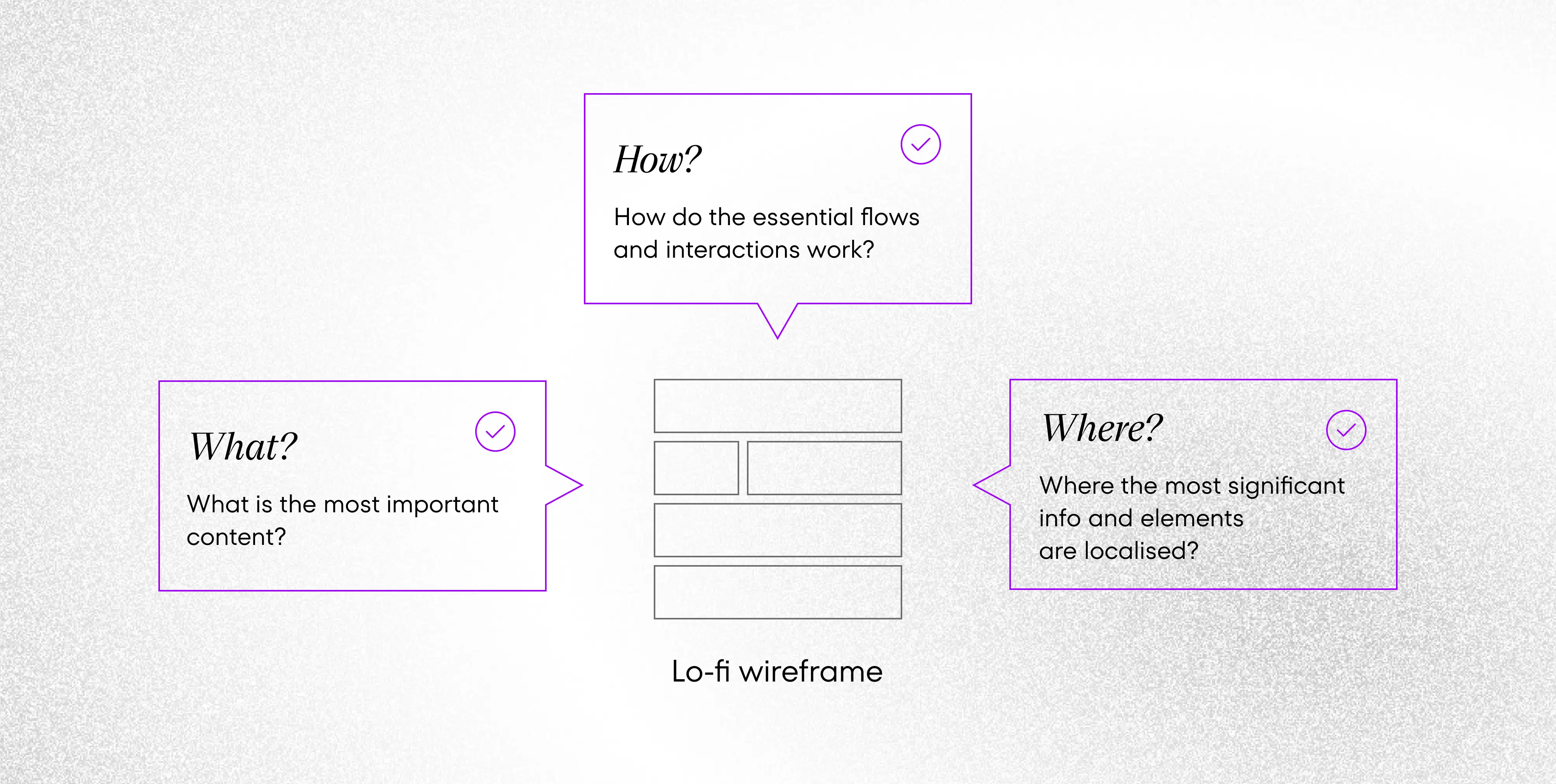
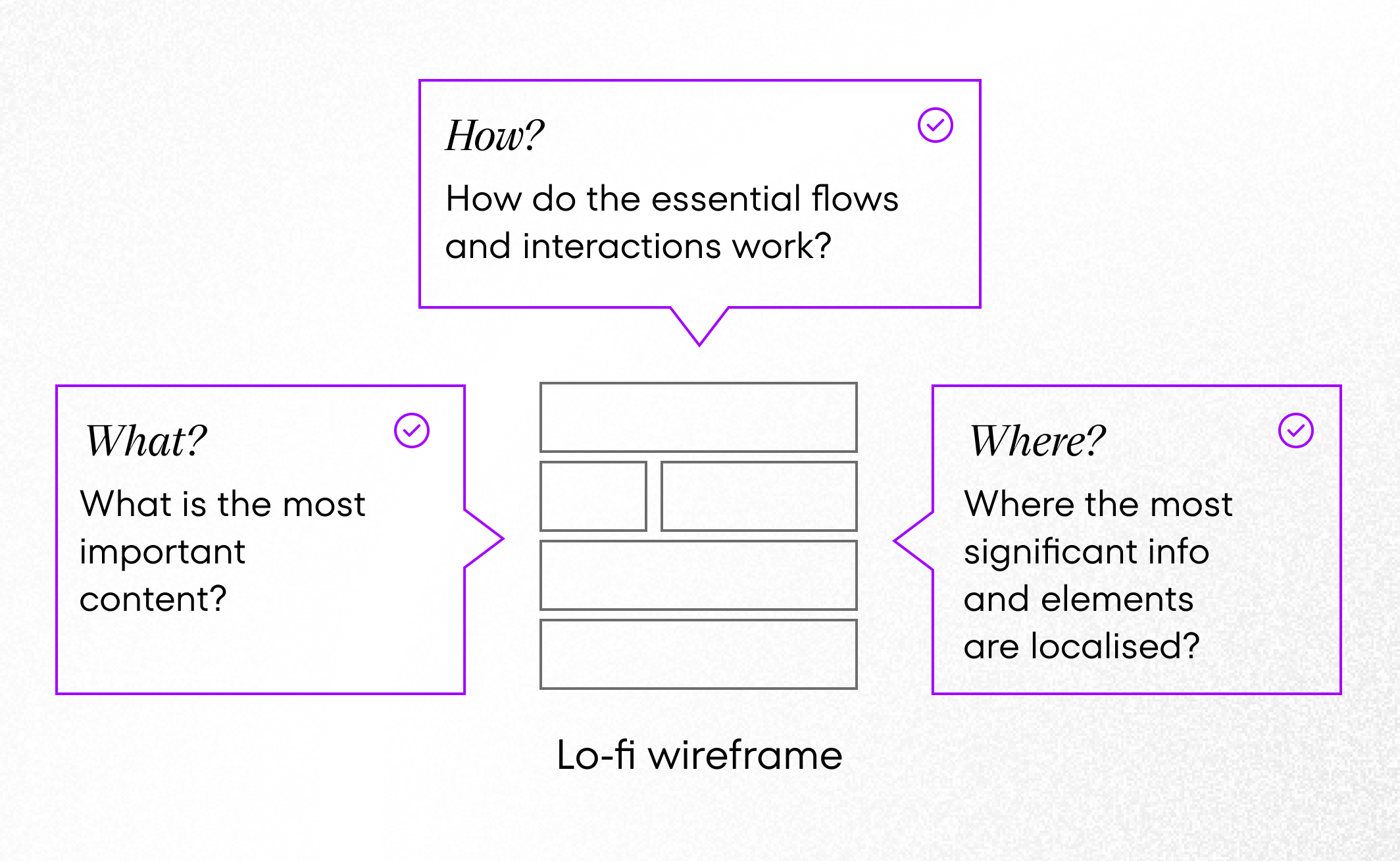
Wireframes should answer the following questions:
- WHAT is the most important content?
- WHERE the most significant information/elements are localized in the app?
- HOW do the essential flows and basic interactions work?


What is essential for a low-fidelity to be efficient is to express the app architecture organization and essential features behavior. Sometimes there will be only 3 screens; sometimes wireframe will need to show more design solutions. Any of these examples is a precious base for a team to start a discussion, from various viewpoints: technical, usable, aesthetic, and business. Are there digital products that do not need lo-fi? I would say no.
A step where the whole team meets
UX design starts from research, and the team is not engaged in the design process at this stage. Based on conclusions and insights, the visualized design solution is created. Wireframing gives this possibility to put the first concepts in shape, understandable for anybody in the team.
Gathering the whole team for a design workshop is a good solution to inspire everybody to focus only on the wireframe for a while. Clear visualization will help to understand design ideas fast and be an inspiration for fruitful discussions on changes or completely new concepts.
Read more: The UX Design Strategy in the Software Development Process
Tools for creating low-fidelity
Pencil and paper at first. Coming to the digital version, if you need to present simple sites with hotspots (the clickable area where a link to another screen or page is added), any design tool will be enough, such as Figma, Invision, or Adobe XD. Willing to express more complex interactions, Axure can be an excellent solution to that.
Let’s think about the iterative approach when choosing software. In the next phases of the design process, the user interface will be looking more and more complex. In this article, we explain the user interface design fundamentals, just look at these examples!
It is good to consider how to build lo-fi, so it saves time on future wireframes expansion. However, UX and UI paths may come across or be done by different designers. It is up to you what tool you choose and what is better for the rest of the creatives. Let the design software selection help you maintain the iterative process and fast and clean at any step.
Benefits of low-fidelity wireframes
Full customization of structure and functionalities
A stage of creating a lo-fi wireframe is a time for building up the information architecture for software. The main logic for interactions is shaped together.
As a result, we get a fully customized, well-thought interface concept. Having the product’s core features completed, the software is ready to be expanded in future sprints. In the next design phases, each component or interaction has the base to be continued with full details preparation that a product needs to have pixel-perfect designs, gestures, transitions, etc.
Adjusting to tech limits
Consulting design ideas with software developers helps the designer to build a solution that will be adjusted to technical requirements and limitations. Together, the whole team can shape the product.
Support for developers
Having the basic concept of the app consulted, everybody knows what to rely on. Thanks to the wireframe, programmers are updated with the design solutions and have accessible material they can refer to anytime, during implementation.
Cooperation building
The lo-fi wireframe is a deliverable everyone can understand. With its simplicity, it engages everybody in the team to reveal their own ideas during discussions. The low- level of complexity also does not block others to suggest changes. For example, if the team sees a complete UI and colorful presentation of the interface, they may be blocked from suggesting changes and feel guilty that a designer is to design from scratch.
Avoiding the doubling of UI work
Thanks to the lesser effort put in designing simple views, the change is also less time-consuming. When making decisions related to the app’s logic and interactions, it is better not to spend time finalizing the pixel-perfect UI styling. In case there are changes in the app’s core behavior required, most of the UI design needs to be upgraded. That would be undoubtedly multiplying efforts, time, and costs.
Possibility of early test conduction
Mistakes are cheaper to be fixed when found quickly. Having the main processes and interactions sketched enables us to conduct usability testing. Taking such actions at the early stage allows us to validate essential apps concepts with very low time and money consumption. As a result, we can bring modifications to our raw wireframe fast, and go ahead with more testing again, up until we reach a fully customized product.
How to convince a client to use/buy it?
Surely, profits are clear. But how to introduce these profits to a client? The client may not understand at first that there is a value within black&white boxes that have only titles. Eventually, they hired a designer and expected a pixel-perfect visual presentation of the idea.
- Show to the roadmap, what happens during research, where lo-fi starts, and what to expect from it. What are the benefits of working on lo-fi? Explain where you can use it (consultations, testing) and how fast changes can be made (lower costs of the client).
- Show the high-fi example. Say that the excellent performance will be delivered surely. Still, to have value for a user, it should have useful features. So lo-fi creation is a process of full customization and, in the end, creating a high-fi wireframe. A product that is not only beautiful but useful.
- Show comparative timelines for time and money consumption: with lo-fi only, with preparing high-fi always before showing any change. That would surely be a good argument.
Inspire others to use wireframes
Seen the question: is it necessary? In light of the arguments above, there are no doubts, and such UX deliverable is highly important to be considered in any project. There are lots of convincing aspects of choosing the approach of lo-fi-focused development. Surely the team might not be aware of all the goods coming from such a thing if they have never worked before with lo-fi. And it is natural. It’s you who knows what convinces your developers, stakeholder, and the rest to work with it. Good luck!


